Petsbook Mobile App
Project for: Petsbook Information & Internet Services Joint Stock Company
Project Time: 4 months
Petsbook started with a simple idea, but a fragmented reality.
Pet owners were using multiple platforms for different needs. One for sharing, another for adoption, another for lost pets. None of them worked well together.
I designed a mobile-first social platform that brings these needs into one clear and usable experience.
Objectives
Create a simple and trustworthy mobile experience for pet owners and animal lovers.
Bring social interaction, adoption, lost pet reporting, and pet care content into one platform.
Design a clear navigation structure that reduces confusion and learning effort.
Build a product that feels familiar, like a social app, but solves real pet-related needs.
Reduce friction in key flows such as sharing, messaging, and discovery.
Approach
I approached the project by combining user research, stakeholder input, and product thinking.
Instead of starting with features, I focused on understanding real user behavior and expectations. Through surveys, interviews, and competitor analysis, I defined what the product should actually be.
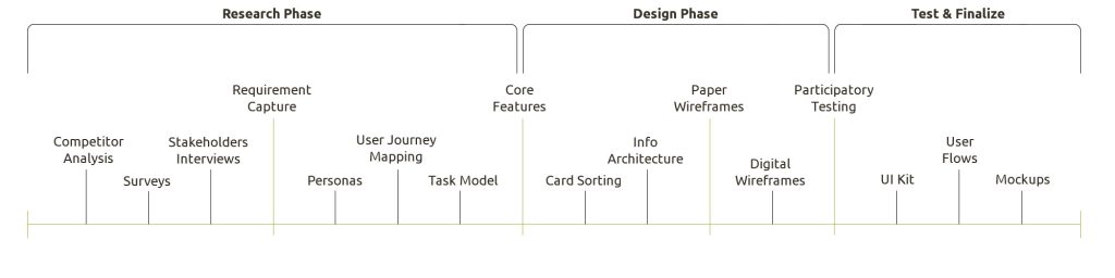
The process was structured into research, design, and validation phases. Each phase helped reduce uncertainty and move the product from a broad idea into a clear and usable mobile experience.
Design Methodology
The project was structured into three main phases: discovery, design, and validation.
In the discovery phase, I focused on understanding the market, user expectations, and business goals. This included competitor analysis, surveys, and stakeholder interviews.
In the design phase, I translated insights into personas, user journeys, information architecture, and wireframes. The goal was to create a clear product structure before moving into visual design.
In the validation phase, I refined the interface, built a UI system, and tested key design decisions to ensure the product felt simple and usable.
This approach helped me move from complexity to clarity while keeping both user and business needs aligned.
Parameters for Selecting Methods:
| Short Time to Market | Long Time to Market | |
| Low Access to Users | Stakeholder Interviews Concept Testing Expert Evaluation Post-Launch Usability Testing | Stakeholder Interviews Concept Design Concept Testing Post-Launch Usability Testing |
| High Access to Users | Requirements Capture Prototype/POC Testing Post-Launch Usability | Stakeholder Interviews Requirements Capture Concept Design Concept Testing Pre-Launch Usability Testing |
Competitor Analysis
I analyzed existing pet-focused social apps to understand what works and where they fail.
The analysis showed that most products already offer similar features such as profiles, sharing, and messaging. However, the real issue was not missing features but poor execution.
Common problems included:
Confusing navigation structures.
Low trust due to fake or inactive profiles.
Weak adoption and lost pet flows.
Performance and usability issues.
The opportunity was clear. Instead of adding more features, the focus should be on clarity, trust, and ease of use.
This insight directly shaped the MVP direction.
| Any user with a need to want to share his/her pet photos with a community & want to shout about a missing/lost pet situation |  |  |
| Company Info | Name: YummyPets Platform: Android & IOS | Name: Petle Platform: Android & IOS |
| Overview | YP is a detailed application that allows users to create their own profile, communicate with other users via writing posts, publish their animal data & photos, find nearby vets, and read some articles about pets. | Pettle allows users to create a geolocation-based social network, and capture & share moments with loved ones. Also, this app has a section for missing pets. |
| MVP Features | Clear & simple interface Good navigation Creating a network (limited basis) | Missing & found pets section Active network |
| Cons | Some lazy load issues Fake & inactive profiles | Login issues DB error messages Not enough editorial support Sharing options is not working properly Bad for battery life |
| Target Market | Any user with a need to get some info about his/her pet, persons who love pets. | Any user with a need to want to share his/her pet photos with a community & want to shout for missing/lost pet situation |
| Usability | Has good usability with a clear & simple interface & good navigation | Does not have the best UI and has problems with the patterns, user amount, and navigation. |
| Any user with a need to want to share his/her pet photos with a community & want to shout about a missing/lost pet situation |
The competitor review showed that similar apps already covered basic social features, but struggled with trust, navigation, performance, and feature clarity. This helped me define Petsbook’s main opportunity: not more features, but a cleaner and more trustworthy experience.
Surveys
User Research
To validate the early product direction, I conducted a survey with pet owners and people who regularly use social networking apps.
The initial assumption was that strong photo and video sharing would be the most important feature for a pet-focused platform. The survey confirmed this, but it also revealed a more critical insight.
Users were not struggling because of missing features. They were struggling because many apps are difficult to understand, have inconsistent navigation, and require too much effort to learn.
These insights helped prioritize usability over feature expansion.
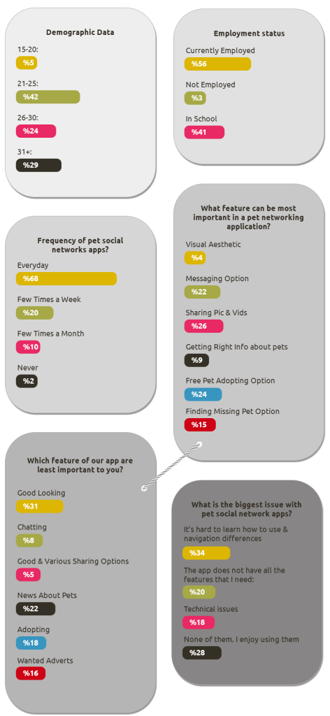
Participants highlighted that:
Sharing photos and videos is essential.
Simple and clear navigation is critical.
Messaging should be easy and direct.
Learning a new app should not require effort.
Visual design alone is not a priority if usability is weak.
Interestingly, only a small percentage of users considered visual aesthetics as the main factor. Most users prioritized usability and clarity over design complexity.
These insights shifted the design direction. Instead of focusing on adding more features, I focused on making the core experience simple, familiar, and easy to use.
The results of this research directly influenced the product structure, interaction patterns, and overall design decisions.
Stakeholder Interviews
I worked closely with stakeholders to understand business expectations, product goals, and technical constraints.
The goal was to align user needs with business priorities.
We focused on:
Short and long-term product goals.
Target users.
Competitive positioning.
Technical limitations.
Definition of success.
This helped define a realistic and focused MVP instead of an overloaded product.
Requirements Capture
Defining the MVP
After combining insights from user research, competitor analysis, and stakeholder interviews, I defined a focused MVP for the Petsbook mobile app.
The main challenge was to support multiple user needs without creating a complex experience. Instead of building a feature-heavy product, I focused on the core functionalities that would deliver real value from the first use.
The MVP includes:
Pet and owner profiles that allow users to create an identity and build trust.
Photo and video sharing to support the main social interaction.
Messaging between users enables communication and connection.
Adoption discovery to help users find and adopt pets.
Lost pet posts to support urgent and emotional use cases.
Pet-related content to provide daily value and engagement.
Clear and simple navigation to reduce learning effort.
A lightweight onboarding experience to help users get started quickly.
The goal was to create a product that feels familiar like a social platform, but more focused and useful for pet-related needs.
This approach allowed me to reduce unnecessary complexity and design a system where each feature supports a clear user intention.
This helped define a focused and realistic product scope.
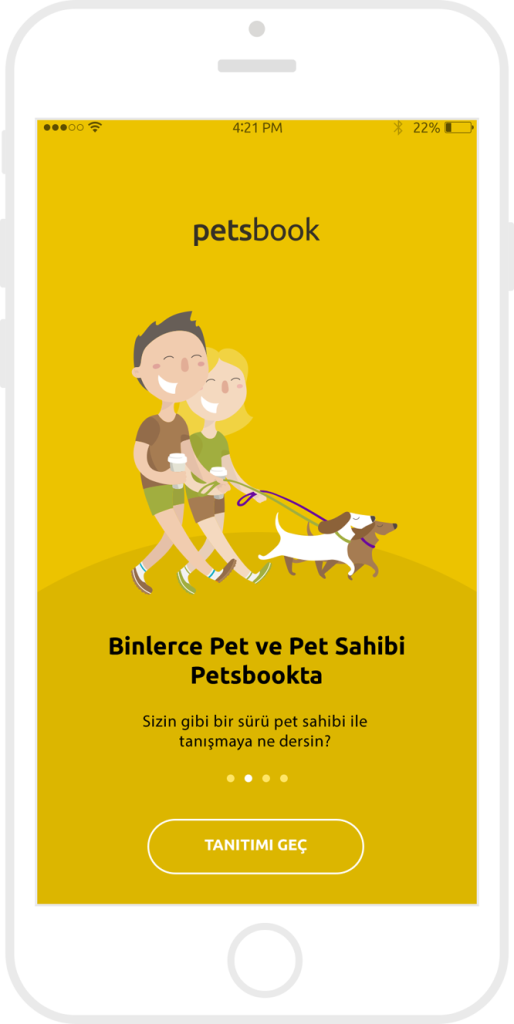
Problem
Pet owners often rely on multiple platforms to meet different needs.
Social apps are used for sharing content.
Other platforms are used for adoption.
Local groups are used for lost pets.
This creates a fragmented experience and reduces trust.
Users also struggle with inconsistent navigation and having to learn different systems for each platform. This makes even simple tasks slower and more frustrating.
Target audience
The product targets pet owners, animal lovers, and people interested in adoption.
The audience includes:
Pet owners who want to share and connect.
People are looking for adoption opportunities.
People who need quick visibility for lost pets.
Animal lovers who want to follow content and engage with the community.
Solution
The solution is a mobile-first social platform that brings all pet-related needs into one experience.
The design focuses on simplicity, clarity, and trust.
Instead of hiding features behind complex structures, key actions are visible and easy to access. This helps users understand the product quickly and complete tasks without friction.
The product combines social interaction with practical tools, making it useful for both everyday use and urgent situations such as lost pets.
App Features
Based on the research and stakeholder input, I focused the first version of the app around the features that could create the strongest user value:
- Pet and owner profiles.
- Photo and video sharing.
- Messaging between users.
- Adoption discovery.
- Lost pet visibility.
- Daily pet care content.
- Clear navigation.
The goal was to create an app that feels familiar as a social platform, but more useful for pet-related needs.
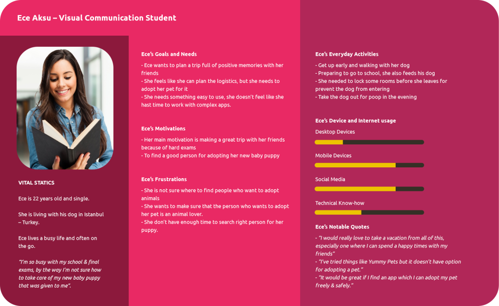
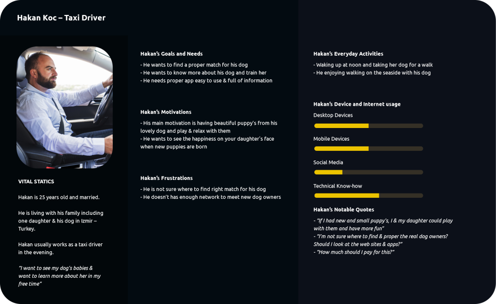
User Personas
I created personas to represent different motivations behind pet-related behaviours.
Petsbook needed to support more than one type of user. Some people wanted to share and connect with other pet owners. Some were looking for adoption opportunities. Others needed quick visibility in urgent situations, such as finding a lost pet.
These personas helped me make better product decisions around profile structure, messaging, discovery, trust signals, and navigation.
User Journey Mapping
I mapped a key user journey to understand where users may feel confusion, frustration, or lack of trust.
Key insights:
Users needed clearer filters
Profiles needed stronger trust signals
Messaging feedback was not clear enough
Users needed better clarity between user types
These insights helped translate user concerns into clear design decisions.
| Stages | Starting Point | Initial Interactions | Task Input | Task Collaboration | Task Completion |
| Actions | Hakan started to research websites and apps to find a proper match for his dog. | Try to discover the app after login. Data input for pet profile & himself. Start searching the app for a proper match. | Open Petsbook and use the hamburger menu. Find & check out navigation & page structure. | Sorts all available users according to his criteria. Write messages to appropriate people. | Collect all answers from eligible candidates. Make an appointment using the site to discuss eligible candidates. |
| Thought Process | What is the best way for me to find a good match for my dog? How much time should I allocate for this process? | What should I use to find a proper match for my pet? What kind of pet do I want for my pet? I need to search online for top rated pet network apps. | Does the search section work as it should? Does it actually feel convenient to have everything in one place? | Does the site have all the necessary filters that I want? What is the difference between approved users and normal users? | How many days or hours will it take to get answers from users? What should I do if they want money for this? |
| Feelings | I’m excited to use this app but I hope it’s not going to be hard. What If I couldn’t find a good match for my dog? | It’s frustrating that no app has all the futures that I need. What if most of the profiles are fake or scammers? | From previous experiences, I was worried that apps do not have all the features that I need. My time is so limited, I am worried about this will be a waste of time. | I’m excited to finally find the application I’m looking for. I’m happy that the app has lots of users from my area. | I’m so happy to finally find the right dog for my pet. Reporting users who want money for this job is really good |
| Opportunities | Planning & Research & Initiation Make the filter section more visible. Put an indicator to reveal that messages have been read. | Collaboration Make the filter section more visible. Put an indicator to reveal that messages have been read. | Last Step Visualize some important sections with using some icons & contrast. |
These insights helped translate emotional user concerns into clear design decisions.
Card sorting & Information Architecture
Because the product includes multiple features, information architecture was critical.
I used card sorting to understand how users group features and content.
The final structure was based on user logic, not assumptions.
Main sections:
Feed, Profiles, Messages, Adoption, Lost pets, Notifications, Settings.
This helped create a navigation system that feels natural and easy to use.
Self card sorting
Organizing feature concepts into logical flows
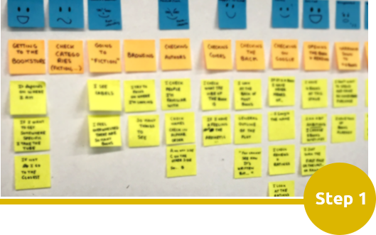
User card sorting
Users were tasked with sorting randomized card stacks in an order that seemed most logical

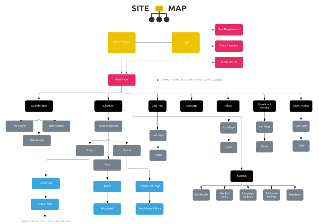
Site map creation
User feedback was reviewed to construct many iterations of site maps each simpler than the last
Paper wireframes
I started with paper sketches to quickly explore layout ideas and user flows.
This allowed me to test different structures without over-investing in details.
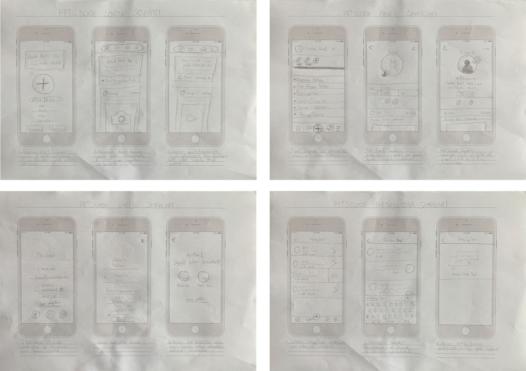
The wireframes helped define layout hierarchy before visual design, reducing unnecessary steps in sharing, profile discovery, and navigation.
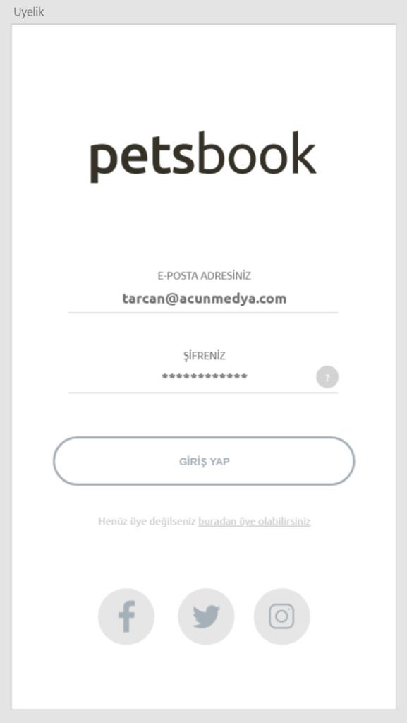
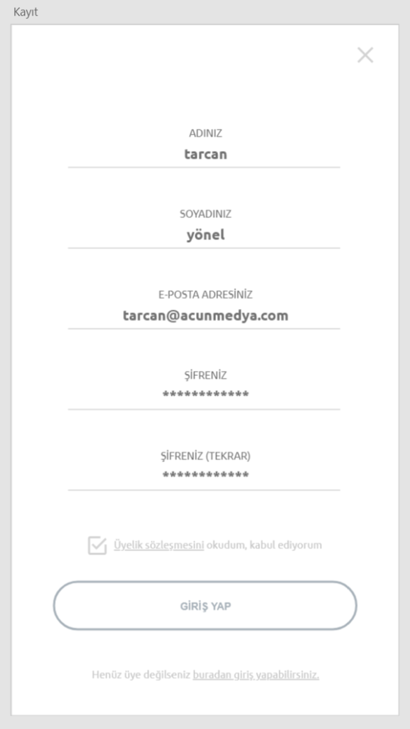
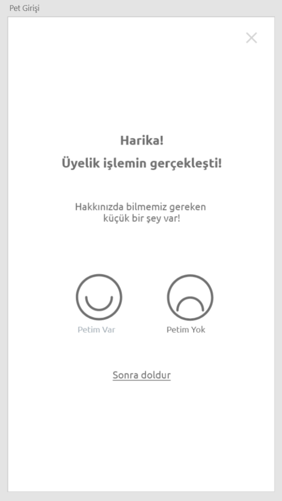
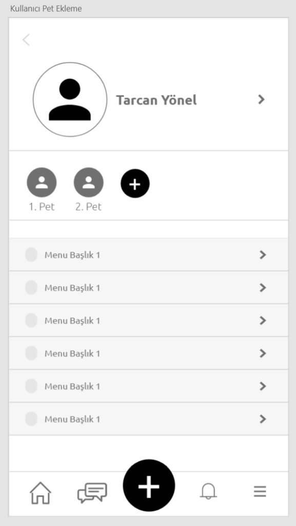
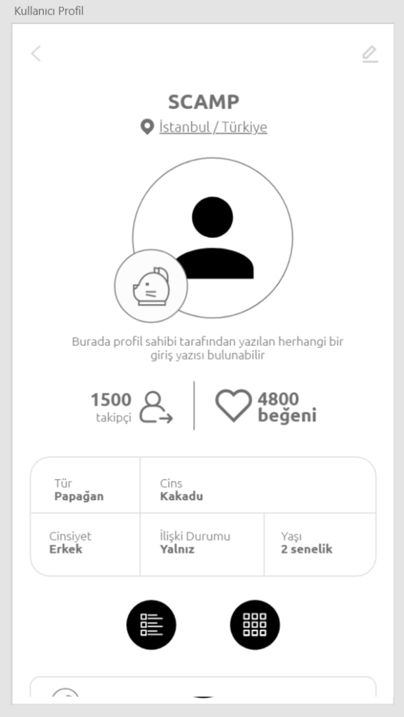
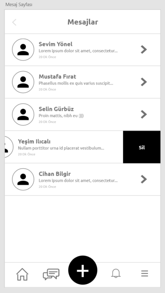
Digital Wireframes
After validating the structure, I created digital wireframes.
The focus was on hierarchy, spacing, and interaction clarity.
Core actions were made easy to access, and unnecessary steps were removed.
Final UI Design
The final design reflects the emotional nature of pet ownership.
A warm and friendly visual language was used to create a welcoming experience.
At the same time, the layout remains clean and readable.
Key decisions:
Strong use of imagery to create emotional connection.
Clear profile structure.
Simple navigation.
Readable typography.
Balanced use of color and whitespace.
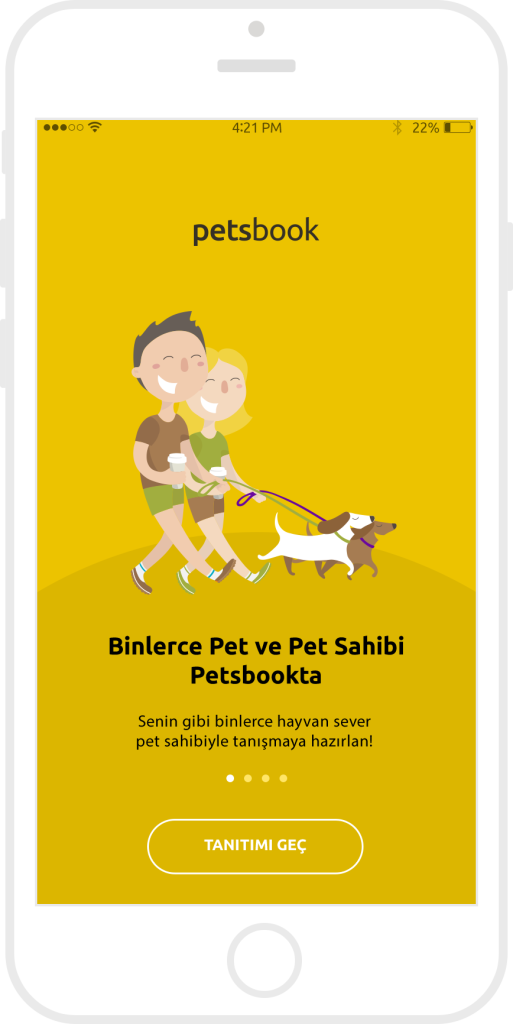
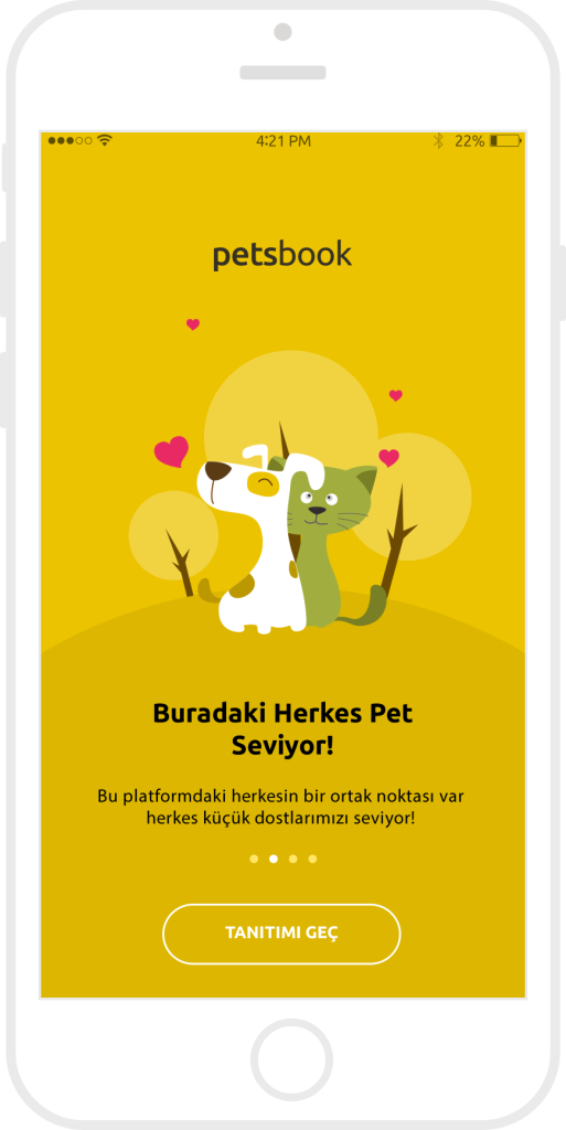
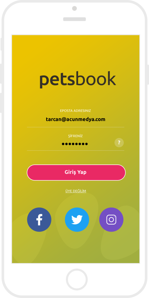
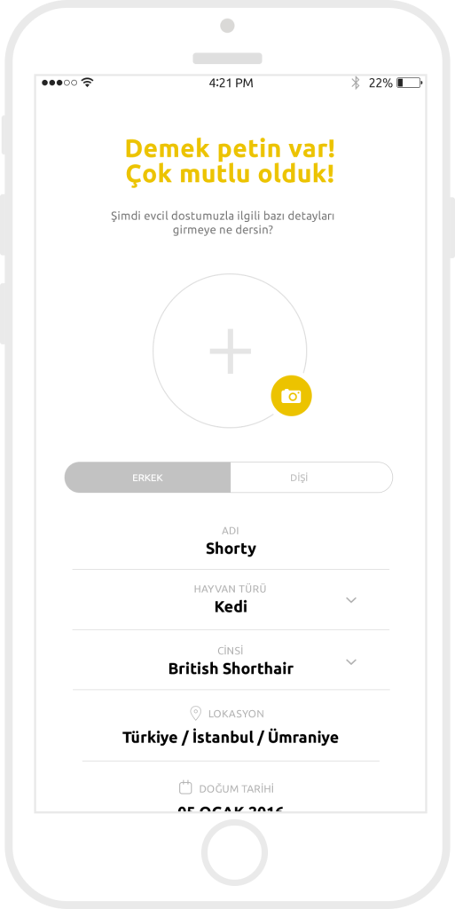
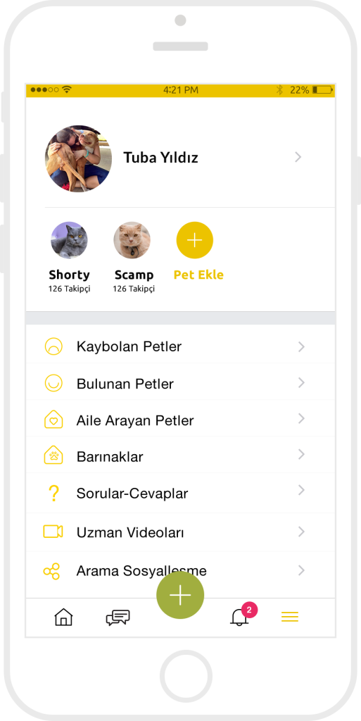
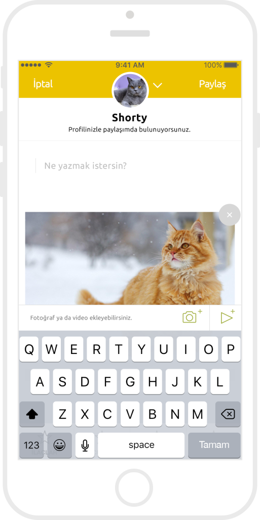
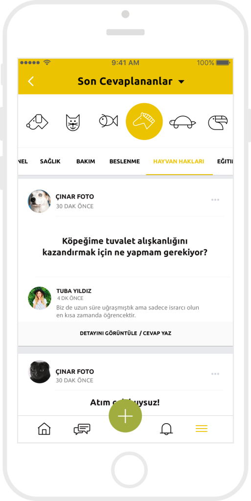
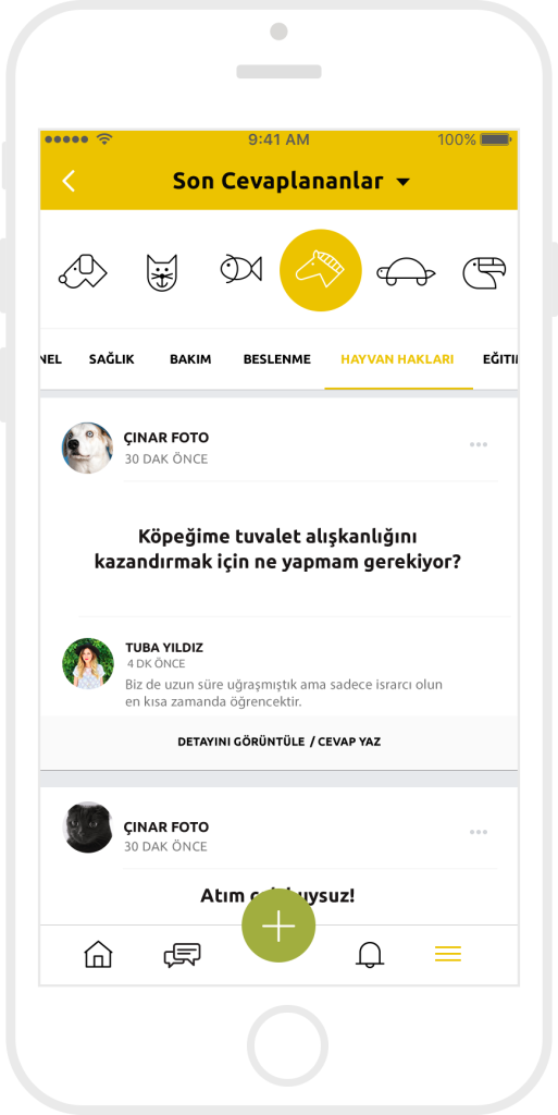
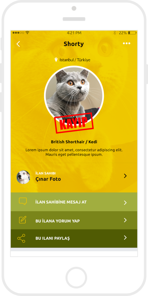
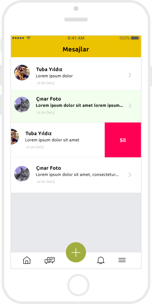
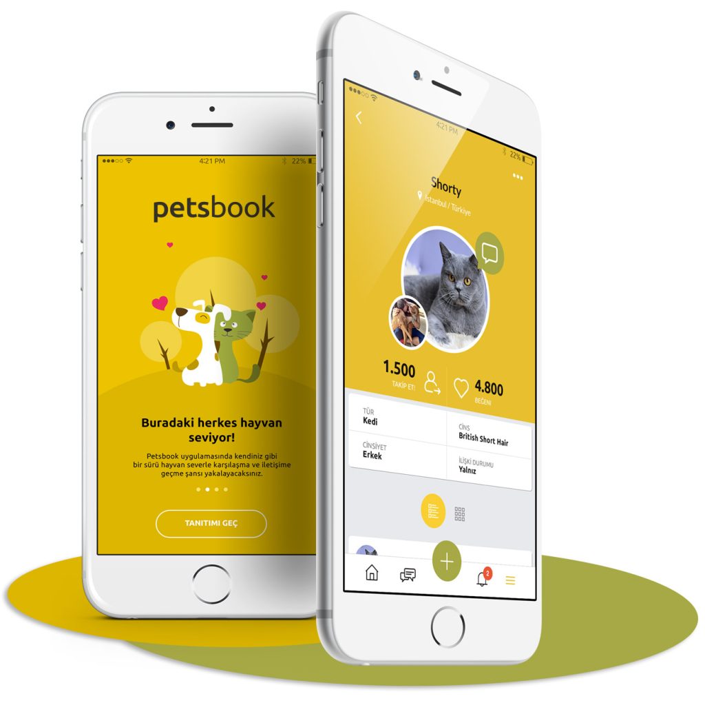
The final screens show how the research insights were translated into a friendly but structured mobile experience.
UI System and Accessibility
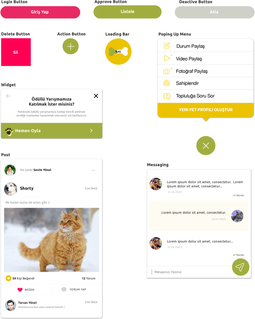
I created a UI system to keep the product consistent, scalable, and accessible across mobile screens.
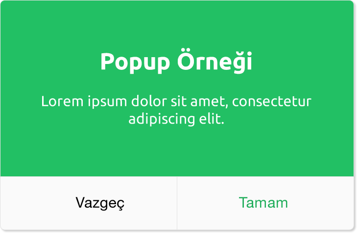
The system included colors, typography, icons, buttons, inputs, modals, and reusable components. The goal was to make the interface feel friendly while keeping it clear, readable, and easy to use.
Accessibility was considered from the early design stage. I focused on readable typography, strong color contrast, clear icon meanings, predictable navigation, and touch-friendly interaction areas.
Key decisions included using high contrast between text and backgrounds, avoiding reliance on color alone, keeping layouts simple to reduce cognitive load, and using familiar mobile patterns to reduce learning effort.
This improved accessibility while also making the overall user experience cleaner and more usable.
Color palette
To enhance ease of use bright backgrounds were applied to provide a foundation for dark texts. Dark foreground colors and text provide high contrast, allowing color-disabled users to see the text.
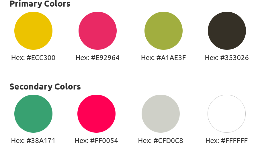
The color palette was designed to reflect a warm, friendly, and approachable product personality.
Yellow was chosen as the primary color to create a positive emotional tone, while neutral colors were used to maintain balance and readability.
Special attention was given to contrast to ensure text remains readable across different backgrounds, supporting both usability and accessibility.
Accessibility Considerations
Accessibility was considered as part of the design decisions, not as a separate checklist.
Instead of only focusing on visual design, I evaluated how users perceive, understand, and interact with the interface.
Key decisions included:
Using high contrast color combinations to support readability.
Avoiding reliance on color alone to communicate important states.
Keeping navigation patterns predictable to reduce learning effort.
Simplifying layouts to support users with cognitive load challenges.
Ensuring tap areas are large enough for comfortable mobile interaction.
These decisions helped make the product more inclusive while also improving overall usability for all users.
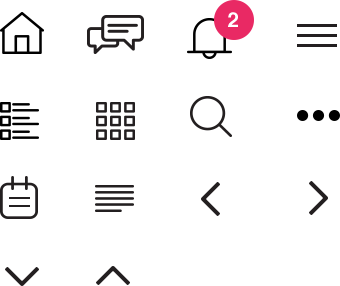
Navigation Icons
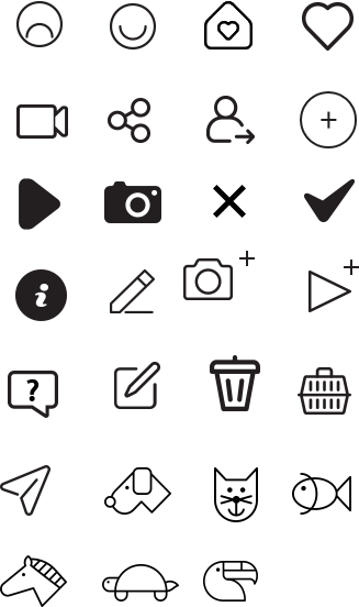
Action other icons
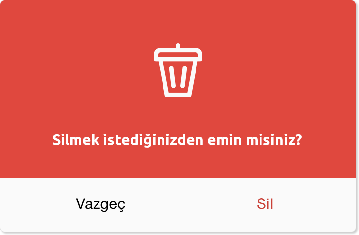
Modals
Typography
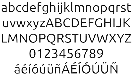
When designing this application, I preferred Ubuntu which is a Google Font.
Ubuntu is neutral, well-glyphed, and has been in use for a long time as a Google Font.
Also, Ubuntu font is readable in all sizes when used in mobile and desktop applications.
For a possible multi-language selection, Ubuntu is an appropriate choice in terms of the languages it supports.
UI Elements
A/B Test Summary
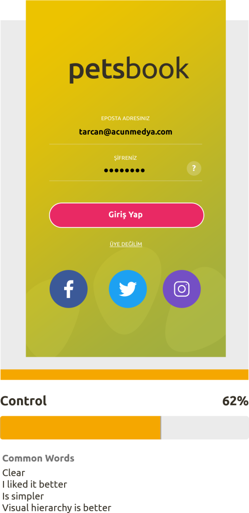
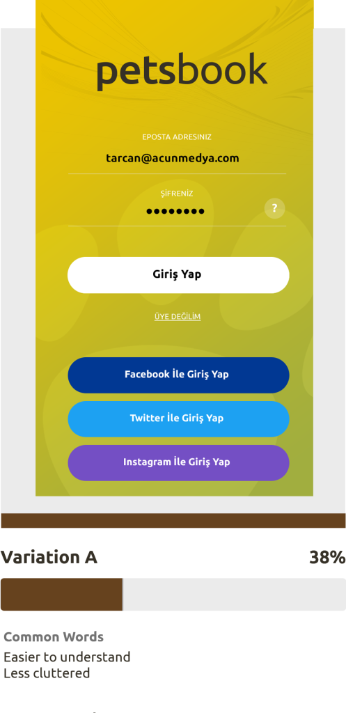
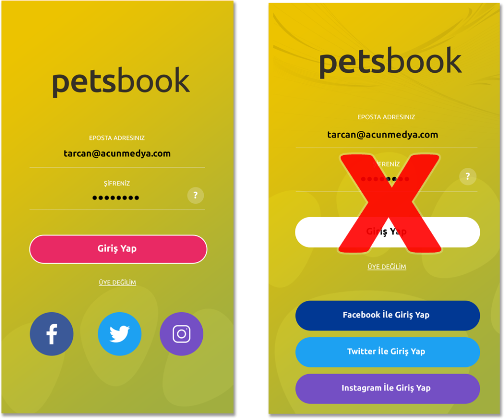
To validate the onboarding direction, I tested two design variations with 50 users.
The goal was to understand which version created a stronger first impression and made users more likely to sign up.
31 out of 50 users preferred the simpler design, which represented 62 percent of the test group.
This confirmed that reducing visual complexity, increasing whitespace, and creating a calmer first screen made the app feel easier and more inviting.
Based on this result, I kept the simpler direction and applied the same clarity principle across the product.
This result confirmed that simpler interfaces increase user confidence.
Test Hypothesis
Users may prefer simplicity instead of variation A’s design with large buttons and a more complicated background.
Result
Based on a sample size of 50 respondents, 31 users (62%) chose the control design – proving my hypothesis.
The control design will be retained.
Conclusion
A simpler design utilizing more whitespace may yield higher signup rates among users.
Outcome
This project transformed a complex idea into a clear mobile product.
The result includes:
A defined MVP based on real user needs.
A simplified information architecture.
Clear user flows for key actions.
A complete UI system.
Validated design decisions through testing.
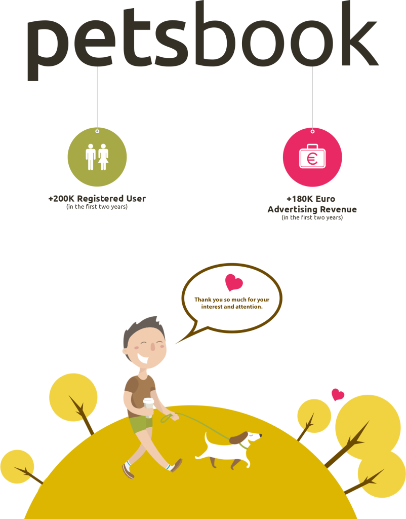
After launch, Petsbook reached over 200K registered users, showing strong demand for a focused pet community platform and validating the core product direction.
Reflection
This project required more than designing screens. It required understanding a complete product system.
My background in system analysis helped me break down the complexity, identify hidden problems, and connect different parts of the experience into a clear structure.
I have worked with many different user types throughout my career, and that helped me design Petsbook for emotional, practical, casual, and urgent use cases at the same time.
The project shows how I approach product design: I simplify complex systems, make user needs visible, and turn broad ideas into usable digital products.
Instead of designing isolated screens, I focus on how systems work together and how complexity can be simplified for users.