
Fashion E-Commerce Website Design for Şeyma Subaşı
Project for: Acunmedya / Şeyma Subaşı
This project was created for Şeyma Subaşı’s private fashion collection, with the goal of designing an elegant and conversion-focused e-commerce experience for her branded products.
The website needed to feel closer to a fashion editorial than a standard online shop. The collection was strongly image-driven, so the interface had to support large campaign visuals, product-focused layouts, clean typography, and a smooth shopping experience from discovery to product detail and add to cart.
The main challenge was to balance brand image and commercial performance. The site had to look premium, minimal, and stylish, while still making products easy to browse, compare, filter, and purchase.
Tool: Sketch, Adobe Photoshop, Adobe Illustrator
My Role
I worked on the UX and UI design of the e-commerce experience, including the overall structure, homepage layout, product listing logic, product detail page, visual direction, typography, buttons, icons, shopping interactions, and key conversion points.
My role covered both the customer experience and the visual system behind the interface. I designed the screens with a strong focus on fashion presentation, product visibility, clear navigation, and reducing friction in the shopping flow.
The Challenge
The project needed more than a beautiful homepage. It had to support real shopping behavior.
Fashion customers often browse visually first, then decide through product details, size, price, imagery, and trust signals. Because of this, the experience needed to work on two levels:
First, it had to create a strong emotional impression through large visuals, editorial sections, and campaign-style layouts.
Second, it had to guide users clearly toward product discovery, product detail pages, size selection, add to cart, and checkout intent.
The design direction had to stay minimal and premium, but not become too abstract or difficult to use.
UX Goals
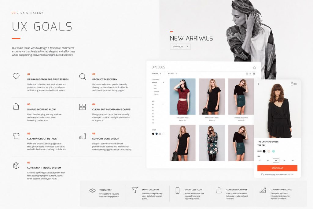
The main UX goals were:
– Make the collection feel desirable from the first screen.
– Help users discover products through both editorial sections and classic product listing pages.
– Keep the shopping flow simple and easy to understand.
– Make product cards visually clean but still informative.
– Make the product detail page clear enough for users to choose size, color, and add the item to the bag confidently.
– Support conversion without making the interface feel aggressive or sales-heavy.
– Create a lightweight visual system with reusable typography, buttons, icons, color accents, and layout rules.
User Research Direction
Since this was a fashion e-commerce project, the research direction focused on shopping behavior, visual decision making, and the expectations of users buying clothing online.
The main user questions were:
– How do users discover fashion products online?
– What makes them trust a new fashion collection?
– What information do they need before adding a product to the bag?
– How important are campaign visuals compared to standard product grids
– Where can the interface reduce hesitation?
The findings shaped the structure of the homepage, product listing page, product detail area, and add to bag behavior.
Persona Example
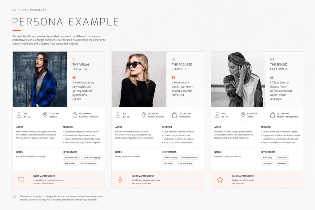
The Visual Browser
This user enters the site without a specific product in mind. She wants to explore the collection, understand the style, and get inspired by campaign visuals.
She responds well to large images, editorial sections, look-based shopping, and clean presentation.
Her main need is inspiration before decision-making.
The Focused Shopper
This user already knows what kind of product she wants. She wants to filter quickly, compare items, check price and size, then move to purchase.
Her main need is clarity, speed, and confidence.
The Brand Follower
This user is interested in Şeyma Subaşı’s personal brand and collection identity. The shopping experience should feel connected to the brand, not like a generic fashion store.
Her main need is emotional connection and trust.
Information Architecture
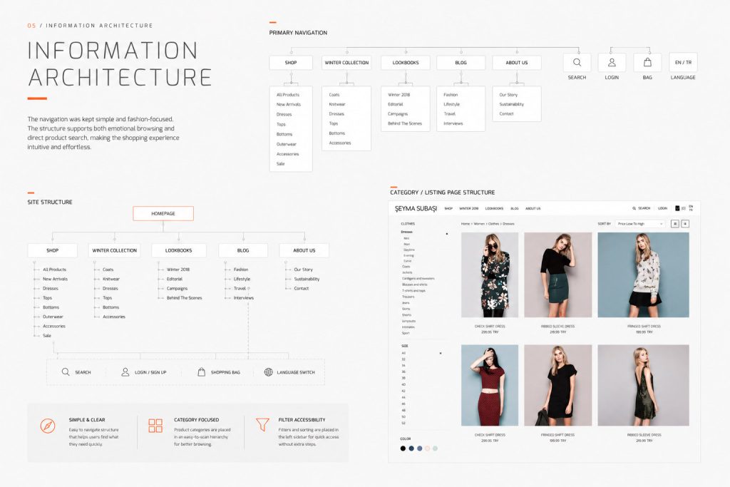
The navigation was kept simple and fashion-focused.
Main sections included:
Shop
Winter Collection
Lookbooks
Blog
About Us
Search
Login
Shopping Bag
Language Switch
The product categories were placed clearly in the left sidebar on listing pages. This made browsing easier without hiding important filters behind extra clicks.
The structure supported both emotional browsing and direct product search.
Homepage Design Approach
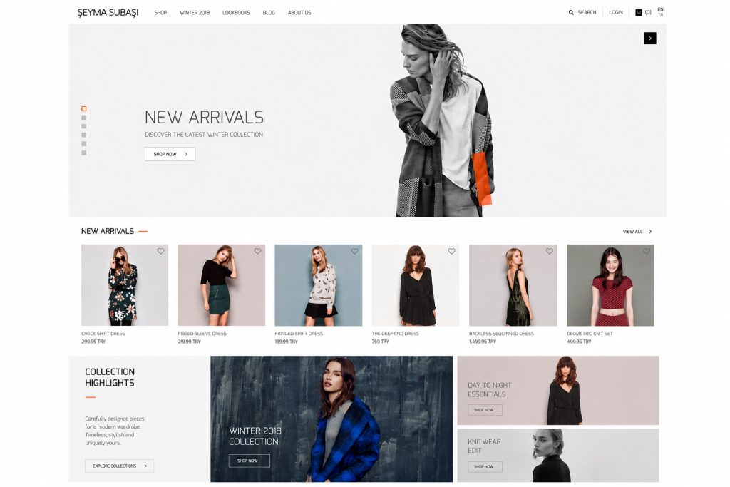
The homepage was designed as a mix of editorial storytelling and commercial entry points.
Large campaign visuals were used to create an immediate brand impact. Instead of showing only product grids, the homepage introduced collections through full-width fashion imagery, look-based sections, and selected product highlights.
This helped the site feel more premium and less transactional.
The homepage included:
Hero campaign area
New arrivals section
Collection highlights
Shop by look area
Featured products
Product recommendation modules
Editorial fashion blocks
This structure allowed users to move naturally from inspiration to shopping.
Product Listing Page
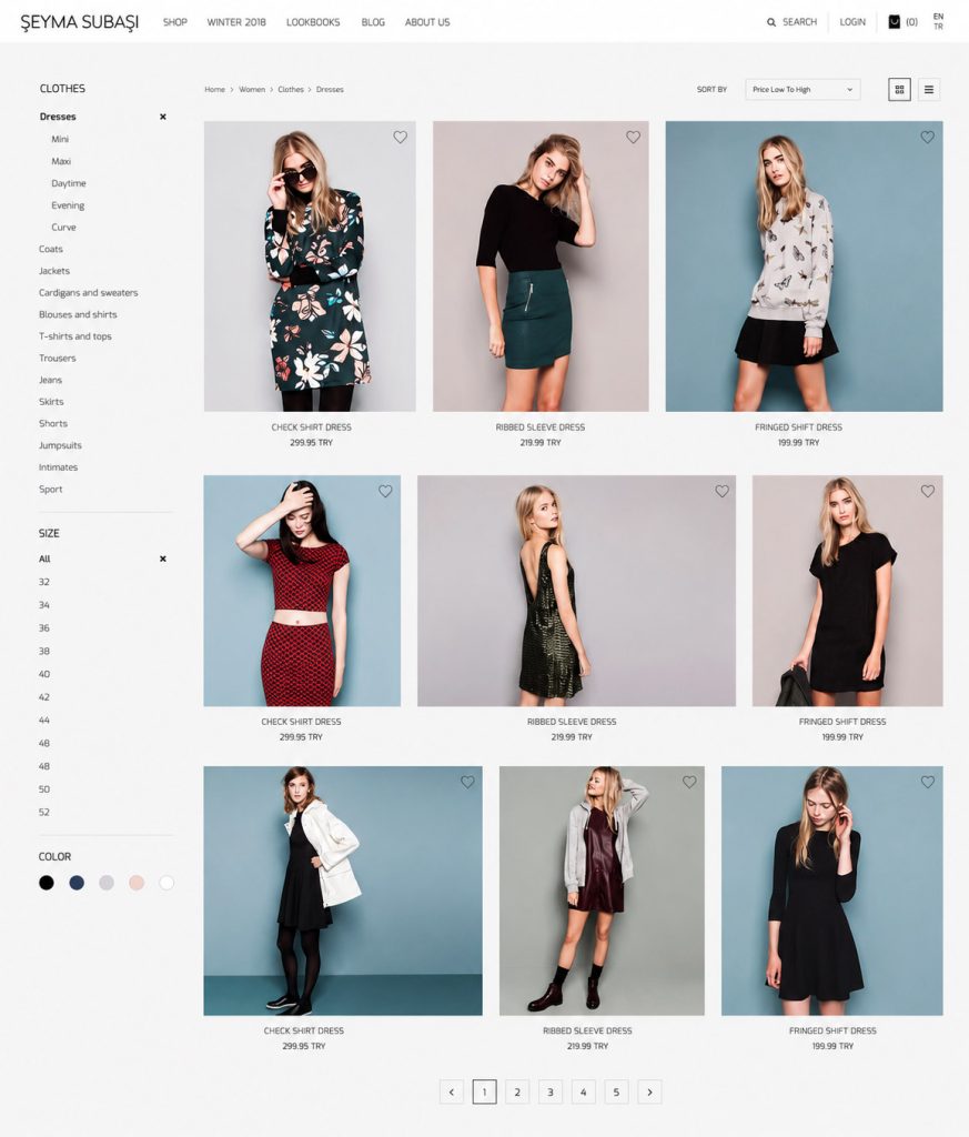
The product listing page focused on easy browsing and comparison.
The left sidebar supported category and size filtering, while the main area used a clean grid with strong product photography.
The design used different image sizes in some areas to keep the page visually dynamic. This helped the product listing feel closer to a fashion layout, while still keeping the grid understandable.
Key decisions:
Clear category navigation
Visible size filters
Simple sorting
Large product images
Minimal product names and prices
Clean spacing
Low visual noise
The goal was to let the products lead the experience
Product Detail Page
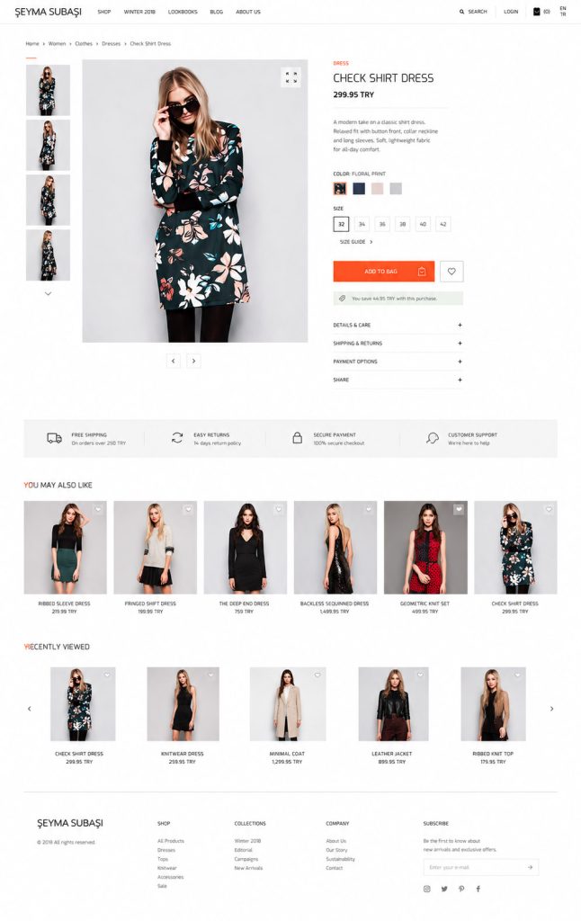
The product detail page was designed to reduce hesitation before purchase.
The layout gave enough space to the product image while keeping the purchase area visible and structured.
Important elements included:
Product name
Short product description
Price
Color selector
Size selector
Add to Bag button
Discount or savings message
Product imagery
Category context
The purchase area was designed to be calm and readable. The add to bag action was visible without making the page feel overly commercial.
Conversion Thinking
The main conversion focus was on reducing friction between product interest and adding to the bag.
The design supported this by making product images large, product information easy to scan, and the add to bag button clearly positioned.
The shopping experience avoided unnecessary complexity. The user could browse, filter, open a product, select options, and add it to the bag without distraction.
Small conversion details included:
Clear product price
Visible color and size options
Simple add to bag action
Product recommendation areas
Right side product highlights on homepage
Fast access to the shopping bag
Clean navigation and search
Visual Design Direction
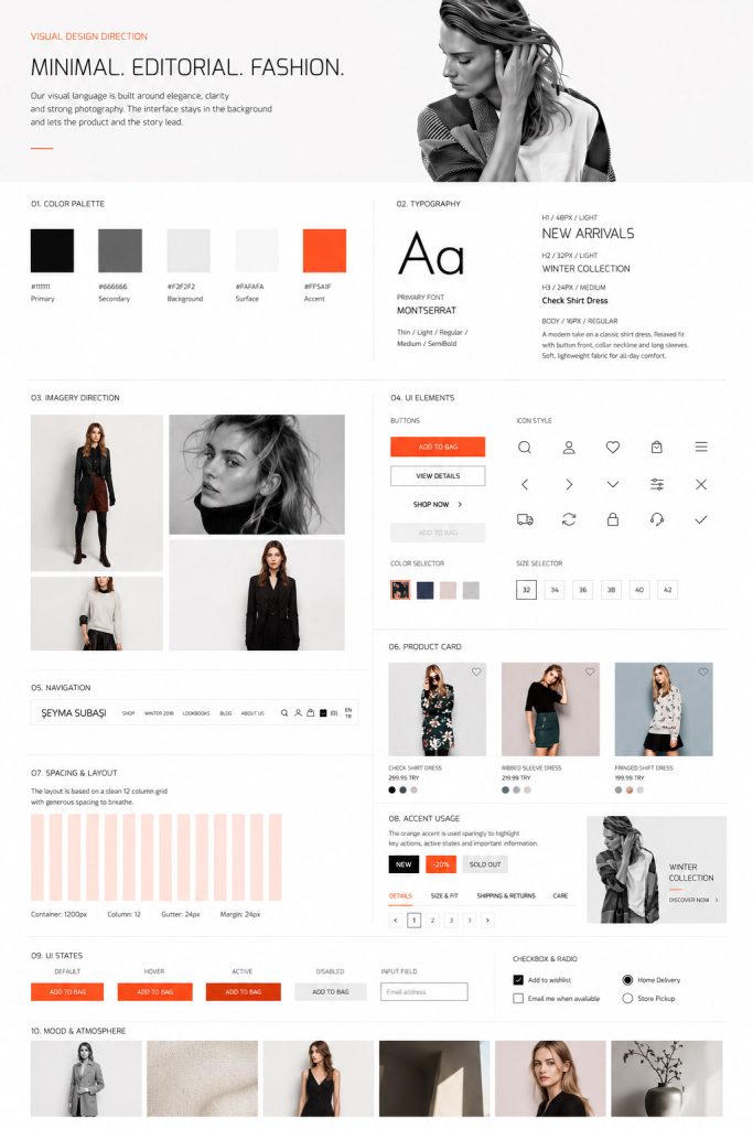
The visual language was minimal, fashion-focused, and editorial.
The interface used a mostly white and light gray background to keep attention on photography. Black, gray, and a strong orange accent were used to create contrast and guide attention.
The orange accent worked as a brand energy point. It was used carefully in visual markers, selected states, and key highlights.
The style was built around:
Large fashion imagery
Thin typography
Generous white space
Soft gray backgrounds
Minimal navigation
Editorial composition
Strong but controlled accent color
Typography
The typography direction used a modern, narrow, fashion-oriented style.
The font style shown in the design gives the project a clean editorial feeling. It supports both large campaign titles and small product information.
Typography roles:
Large campaign titles
Clean navigation labels
Product names
Price information
Button labels
Section titles
Editorial text blocks
The goal was to keep the interface stylish without losing readability.
UI System Elements
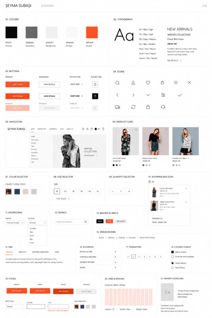
Even though the full original design system files were not available later, the project included a lightweight UI system for consistency.
The system covered:
Buttons
Icon style
Navigation behavior
Product cards
Color selection elements
Size selectors
Shopping bag icon
Search icon
Dropdowns
Typography hierarchy
Grid spacing
Product image ratios
Selected states
Hover states
This helped keep the e-commerce experience consistent across the homepage, listing pages, and product detail pages.
Outcome
The final design created a premium fashion e-commerce experience that combined editorial storytelling with a clear shopping flow.
The project showed how visual design, UX structure, and conversion-focused thinking can work together in a fashion retail environment. It gave the brand a clean digital shopping experience where users could discover collections, browse products, review details, and add items to the bag with confidence.