Product UI Examples from Nielsen & Commspoint Tools
Project for: Nielsen Media Research / Commspoint & Journey
A collection of real product UI screens designed for Nielsen and Commspoint tools. These examples highlight how complex features, data-heavy interfaces, and user flows were structured to support usability and clarity in enterprise environments.
Tool: Figma
My Role
I led the end-to-end UI design of these features across Nielsen and Commspoint tools, from early concepts to final interfaces.
I was responsible for structuring complex data-heavy screens, defining interactions, and ensuring usability across different product areas.
All visual and interaction design decisions were created and refined by me based on product requirements, user needs, and technical constraints.
What These Screens Represent
- Complex feature design in enterprise tools
- Data-heavy interface structuring
- Usability-focused layout decisions
- Handling multiple user scenarios and edge cases
- Real product constraints and requirements
Brand Tracking
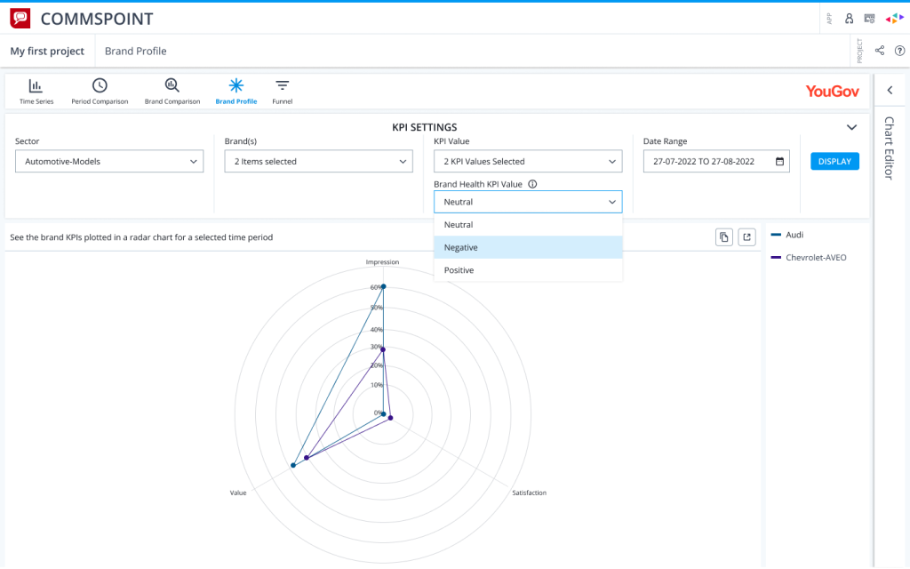
A radar chart view designed to compare selected brand KPIs with clear filtering and KPI sentiment controls.
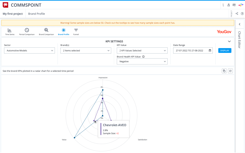
Tooltip and warning states showing how low sample size risks are communicated directly inside the data visualization.
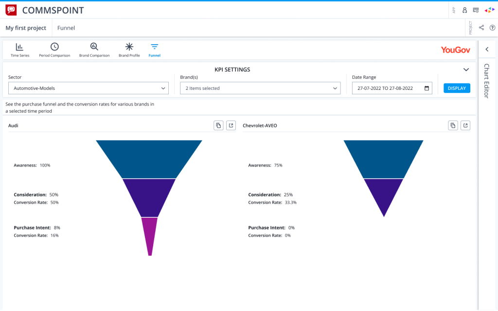
A funnel comparison view designed to make awareness, consideration, and purchase intent differences easy to scan.
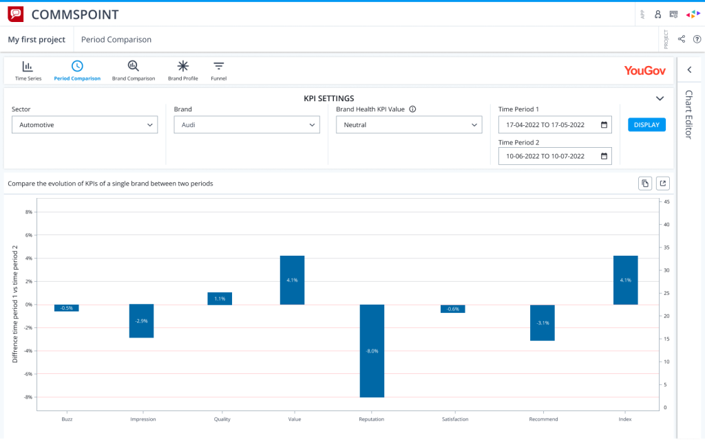
A period comparison chart showing KPI movement between two date ranges with positive and negative changes clearly separated.
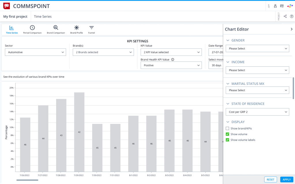
A chart editor panel allowing users to customize demographic filters and display options without leaving the analysis screen.
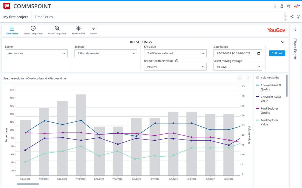
A time series view combining KPI trends and volume data to help users understand performance changes over time.
Folder Management
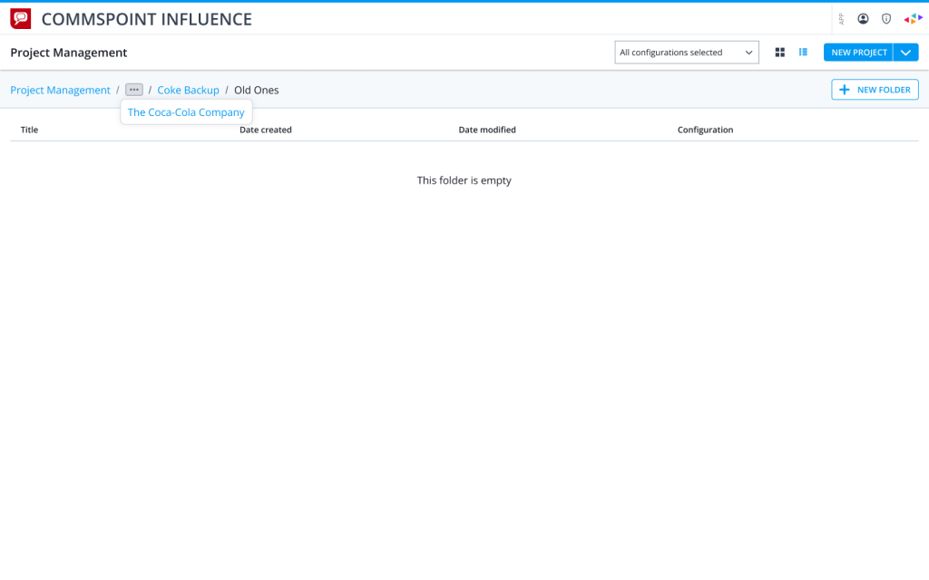
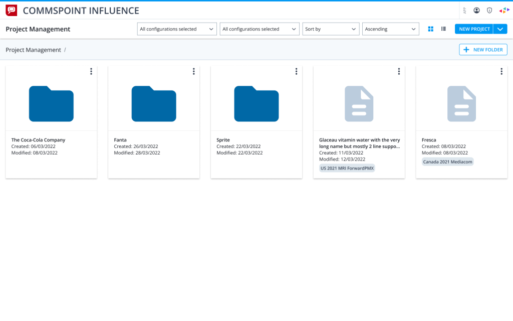
A breadcrumb-based folder structure designed to help users understand where they are inside complex project hierarchies.
A card view for managing projects and folders with quick visual distinction between folders and document items.
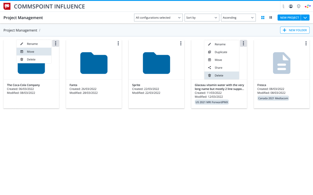
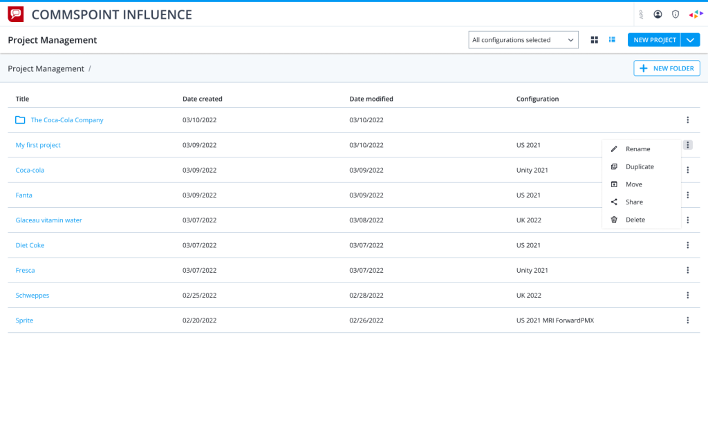
Contextual action menus designed for managing folders and projects directly from the grid view.
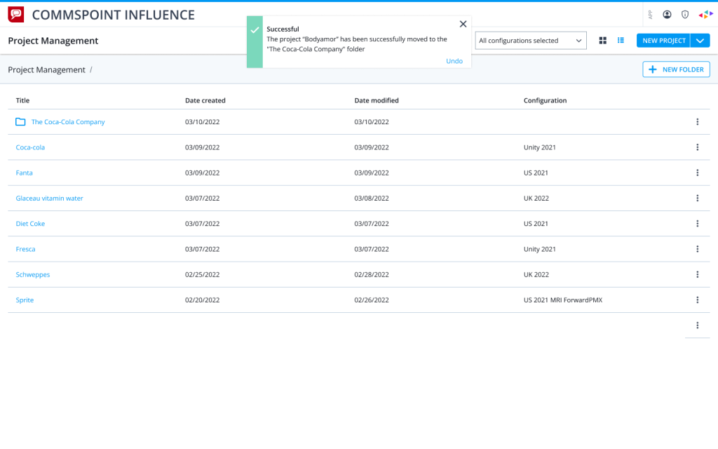
A list view with confirmation feedback showing successful project movement and an undo option.
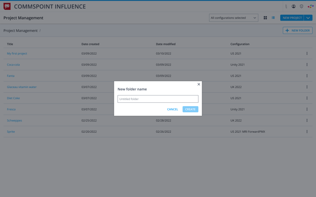
A modal flow for creating new folders while keeping the user in the same project management context.
A list-based project management view with row-level actions for rename, duplicate, move, share, and delete.
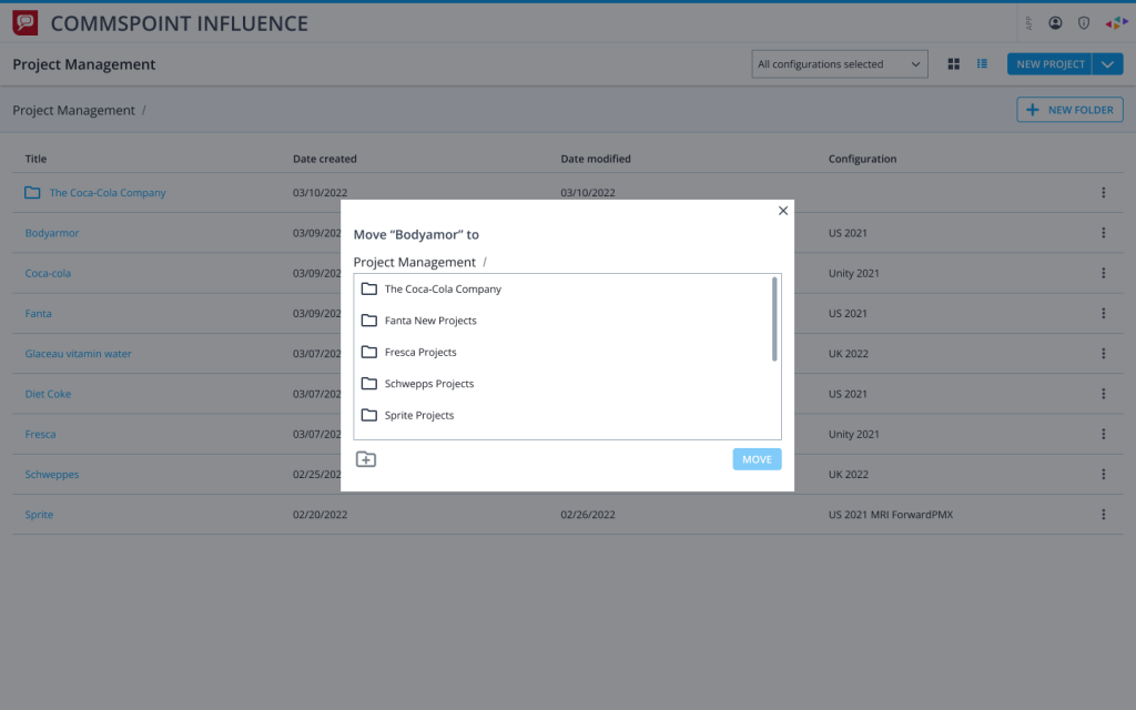
A move dialog designed to help users relocate projects into existing folders with a simple destination selection flow.
Filter Saving
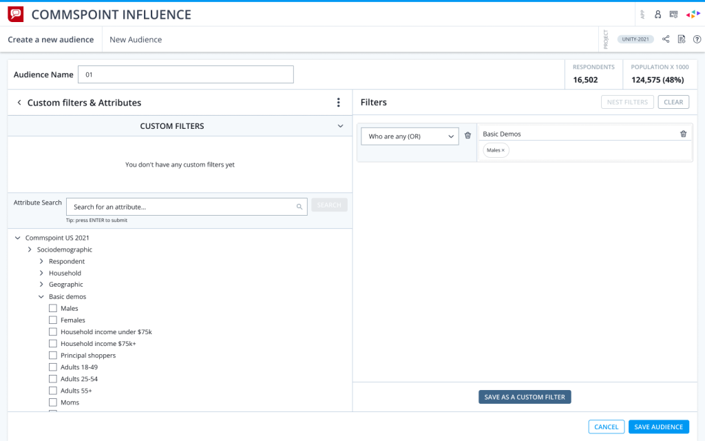
A custom audience builder interface designed to let users combine demographic attributes and save reusable filter sets.
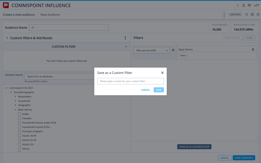
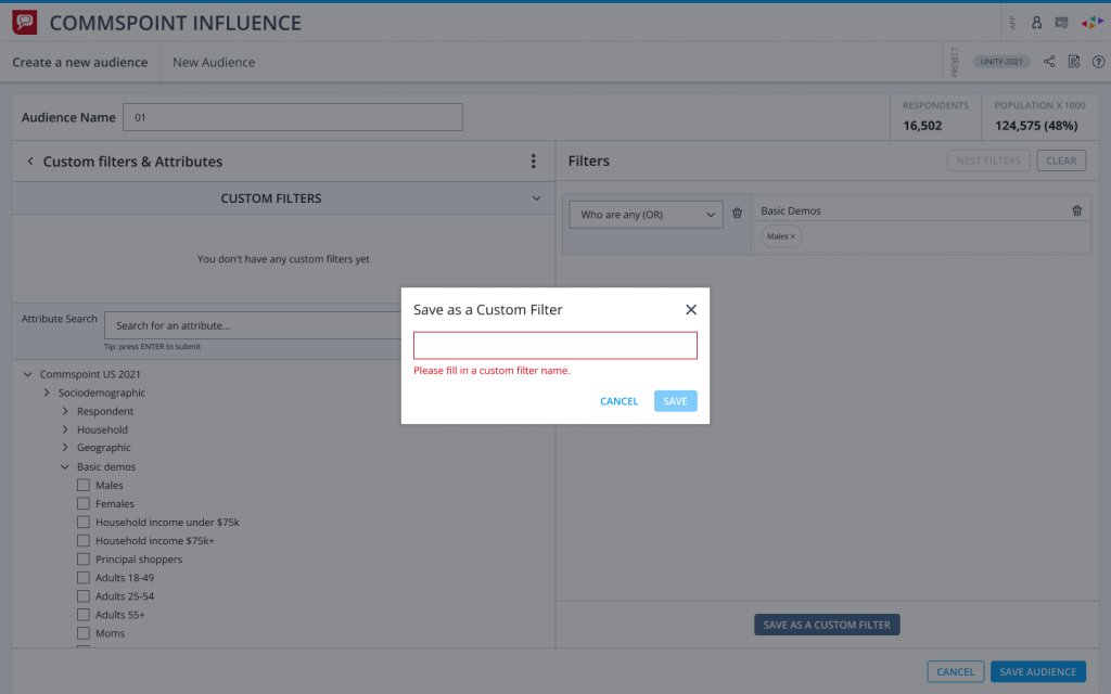
A save dialog allowing users to turn a selected audience filter into a reusable custom filter.
A validation state showing how empty input errors are handled before saving a custom filter.
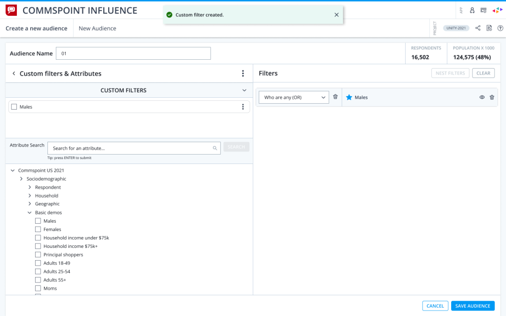
A success state showing the newly created custom filter added back into the audience builder flow.
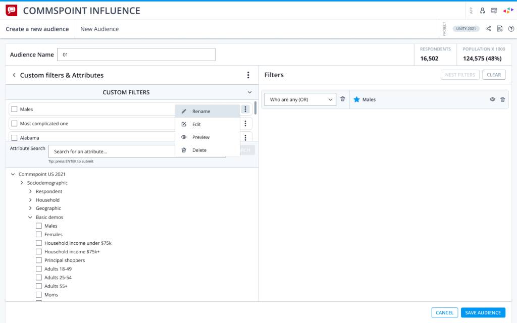
A contextual menu for managing saved filters with rename, edit, preview, and delete actions.
Other Features
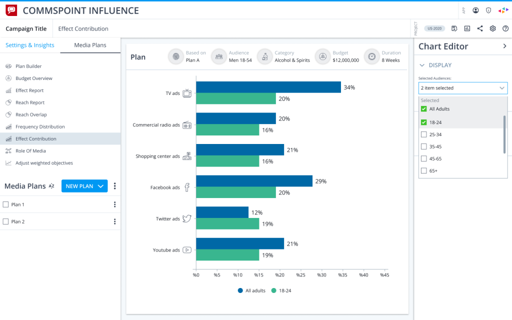
A dashboard-style media plan comparison view showing effect contribution across channels and selected audiences.
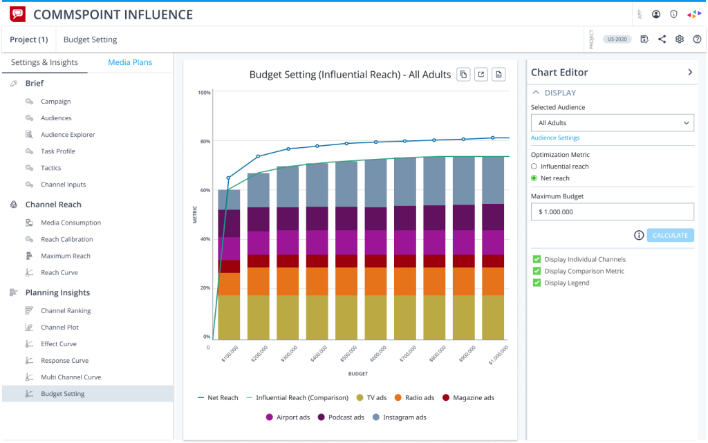
A budget setting interface designed to compare reach curves, channel contribution, and optimization metrics in one view.
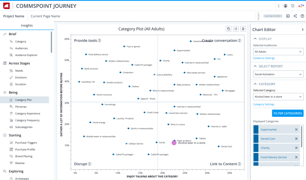
A category plot visualization helps users compare categories across conversation and information gathering dimensions.
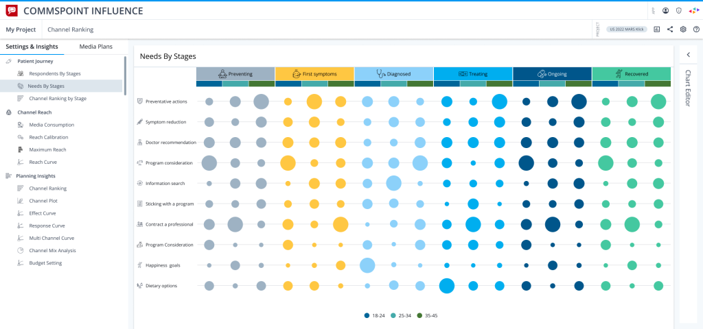
A stage-based bubble chart designed to compare audience needs across different journey stages.
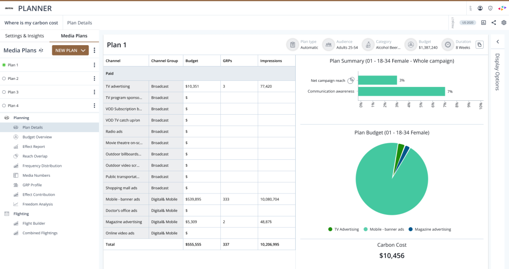
A planner dashboard combining media plan inputs, campaign summary, budget distribution, and carbon cost in one workspace.